In the world of digital aesthetics, brutalist web design stands out for its raw, unrefined presentation and bold departures from mainstream conventions. This style is known for prioritizing function and authenticity, often manifested through stark visuals, robust fonts, and structurally honest layouts. It challenges the dominance of sleek, highly polished web experiences, opting instead for a straightforward, undiluted interaction.
By intentionally utilizing elemental design tools and obvious HTML structures, brutalist websites draw attention to their own construction and purpose. These platforms often break away from what is considered ‘good taste’ in modern web development, embracing a look that can feel unfinished or even jarring. This unique approach not only disrupts aesthetic norms but also offers a more deliberate engagement with users, as exemplified in collections of brutalist UI design from around the web.
Where most websites aim for seamless visual harmony and invisible, polished flows, brutalist sites lean into what is manual, exposed, and unexpectedly honest. This departure has fostered a growing subculture within both the design and user communities, appealing especially to those who seek a more genuine, transparent online interaction.
Authenticity, transparency, and simplicity lie at the core of brutalist principles, which often resonate with designers and users weary of the uniformity and predictability of many modern websites. As the digital landscape continues to prioritize efficiency and user-friendliness, the striking counterpoint of brutalism provides a necessary alternative.
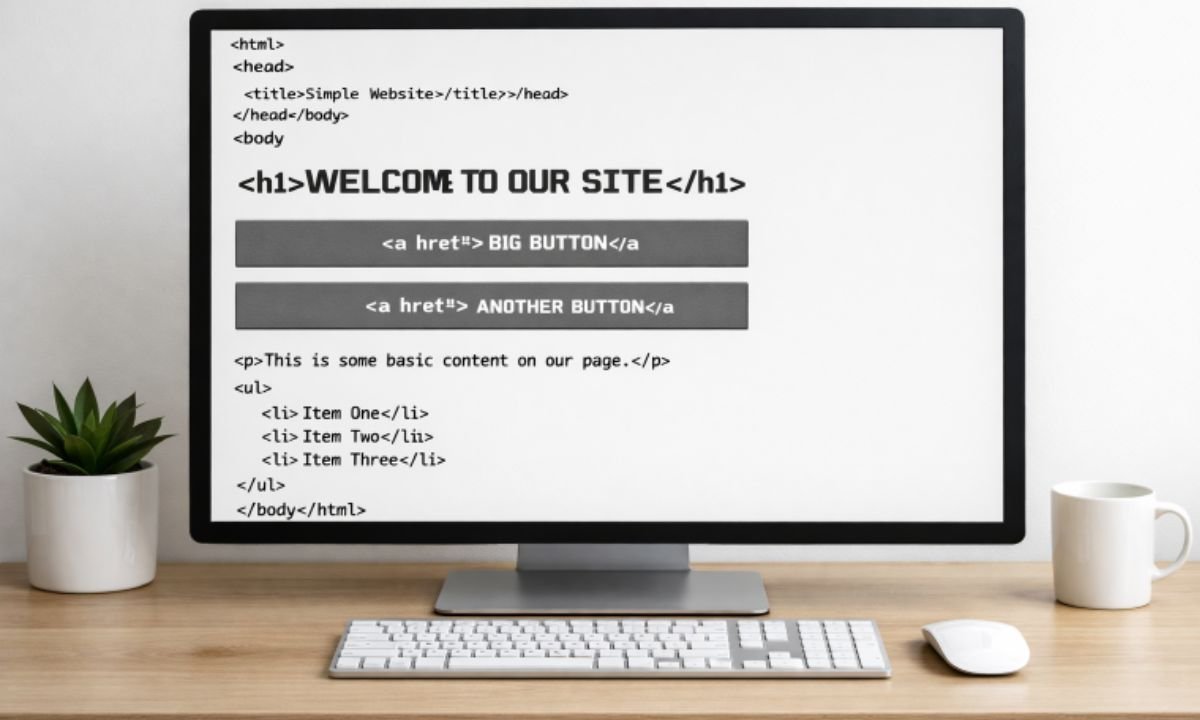
- Raw Aesthetics: Elements such as default system fonts, large buttons, and simple HTML lists are used with minimal embellishment, making the site’s structure readily apparent.
- Bold Typography: Fonts are typically outsized and in-your-face, aiming for maximum clarity and impact. There is little or no attempt to blend with subtler design eras.
- Unconventional Layouts: Brutalist sites are notorious for asymmetry, non-standard grid layouts, and abrupt content separations. This creates a sense of unpredictability that can captivate users.
- Minimalist Color Schemes: These designs tend to employ limited, high-contrast color palettes, often black and white or starkly clashing colors, to make important site elements pop.
The roots of brutalist web design trace back to architectural brutalism, a movement that began in the mid-20th century. Architects like Le Corbusier, Alison, and Peter Smithson championed raw concrete buildings that highlighted material honesty and functional clarity. These constructions were reactions against decorative excess and sought to reveal their inner workings to the observer.
As web designers began exploring digital parallels, brutalist web design inherited this focus on utility and decomposition of visual norms. The style’s unapologetic celebration of structure, purpose, and visible “imperfections” echoes the movement’s architectural ancestors. For more on the architectural origins of brutalism and its broader cultural context, consult this ArchDaily resource.
Brutalist web design is thriving in part because it stands in opposition to the conventions that have become ubiquitous on the internet. Most websites today strive for smooth, visually engaging, and user-friendly designs. While this has led to increased overall usability, it has also created a sense of sameness, with countless websites following nearly identical visual patterns.
The rise of brutalism coincides with a desire for greater diversity and authenticity in digital experiences. Users and designers alike are turning to this style to reclaim control over aesthetics, emphasize substance over polish, and break free from restrictive design systems. The result is often a website that feels more honest, direct, and memorable.
Additionally, brutalist web design offers practical benefits for certain audiences. Developers appreciate how quickly such sites can be built and modified, while users who value function over appearance can navigate them with ease. This utility aligns with broader trends toward minimalism and functional design in the tech industry.
Some prominent examples of successful brutalist websites include:
- Bloomberg: The site’s unapologetically text-heavy approach and lack of unnecessary ornamentation create a unique, content-first experience. CityLab is an example of this design approach.
- Balenciaga: As a high-fashion brand, Balenciaga’s website uses extreme simplicity and a striking layout to distinguish itself from traditional e-commerce platforms. The design reflects “norm core” aesthetics, as discussed in this article.
- Are.na: Focused on creativity and collaboration, Are.na uses a stark, simple aesthetic to foreground user content and ideas over elaborate design features.
Other designers and organizations continue to push the boundaries of brutalist principles, contributing to an evolving conversation about the role of aesthetics and functionality on the web. Interested readers can explore further examples curated in articles from Smashing Magazine.
- Focus on Functionality: Ensure the website’s core purpose is delivered through its design. Avoid unnecessary distractions and frills that detract from usability.
- Embrace Simplicity: Leverage standard web technologies like HTML and CSS with minimal styling. Let the browser’s default appearance shine through where possible.
- Prioritize Content: Let the information drive the layout. Present headlines, calls to action, and navigation in a way that prioritizes clarity and user intent over decorative choices.
While brutalism champions minimalism and rawness, it is important for designers to test their layouts for accessibility and basic usability. Simplicity should not come at the expense of visitors who rely on screen readers or keyboard navigation.
- User Experience: While the rawness of brutalist designs attracts some users, others may find them confusing or difficult to navigate. Consider usability heuristics and your audience’s diverse needs at every step.
- Brand Alignment: Brutalist style does not fit every brand. Businesses must consider whether such an aesthetic matches their identity, messaging, and customer expectations before adopting it.
- Audience Expectations: Consider the background and expectations of your primary users. For highly commercial or luxury brands, brutalist design can confuse or alienate visitors accustomed to refined web experiences.
Brutalist web design presents a fascinating counterpoint to the highly polished interfaces that have become the norm online. By embracing authenticity and focusing relentlessly on purpose and usability, brutalist sites offer distinctive and memorable digital experiences. Designers who incorporate these principles thoughtfully can create websites that truly stand out, both in appearance and in function.